The Template Of Doom
Category: Digital Marketing
Published: 25/10/2018
You may remember the last blog about the amount of Blah Blah Woof Woof we found when we reviewed those 4357 websites?
Well, we also discovered that a huge percentage of businesses adopted a standard template approach to their websites.
The so-called “tennis court” template was the most favoured: Banner top, then text panel left, image right; followed by image left, text panel right; repeat until footer. Sometimes we had to scroll a loooong way down to get to that footer too- and that is where most businesses put their all-important contact details. Strange that!
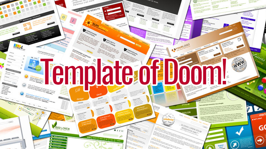
In many cases actually, we found that the website design being deployed looked surprisingly (suspiciously even) like the same website template of the design company that did the work.
Not that there is anything terribly wrong in that methodology if all you want is a basic online presence – but if you want to stand out from the herd it’s better to look like a zebra than a sheep.
For example, to take a group at random, we looked at 640 websites from the construction sector in Scotland alone. If you were in that sector (or any other for that matter) would you want to look better, bolder, more engaging and sharper than the other 639?
If the answer to that is “Yes”, why would your design company make you look like a sheep with an off-the-shelf template website? Does that not say in big letters: We Are No Better/Different From Everyone Else?
We specialise in websites that show you and your business as unique.
We focus totally on your Return On Investment reaching levels of payback of 275%
We don’t believe that one size fits all or that close enough is good enough – we get results.
Contact us now to find out how we can help your website stand out from the crowd more effectively.
Article Listing